
| Color theory is one of my favorite things to teach about. Artists use the ART ELEMENT of COLOR to create EMPHASIS, CONTRAST, TEXTURE and most importantly FEELINGS and EMOTIONS. Color Theory is broken down into three basic categories: the COLOR WHEEL, COLOR HARMONY, and COLOR CONTEXT or how an artist chooses to use color in relation to other colors. | |
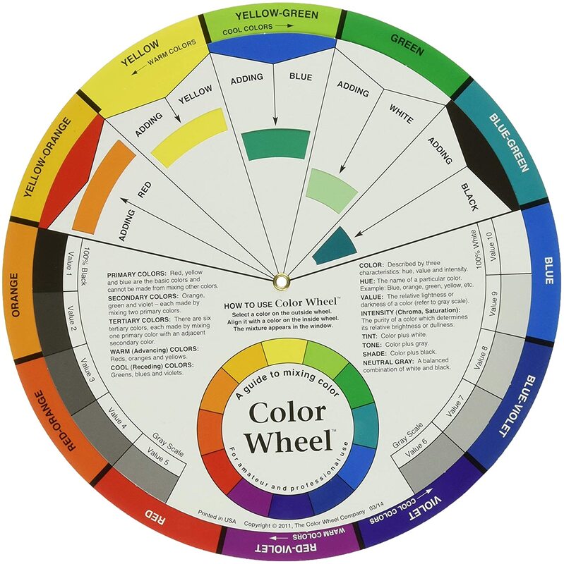 | The COLOR WHEELThe first basic category of color theory is the COLOR WHEEL: A color circle, based on RED, YELLOW and BLUE, is traditional in the field of art. Sir Isaac Newton developed the first circular diagram of colors in 1666. In my classroom, I like to refer to the color wheel as our color calculator. By using this tool, my students can figure out how to mix any color they would like using only the three PRIMARY COLORS ( RED-YELLOW -BLUE) and WHITE or BLACK depending on where their desired color is located on the wheel. |
Today, we are going to create a YUMMY color wheel using cookies as our canvas and frosting as our paint! Believe it our not, we are going to mix ALL of the colors of the color wheel using only our three PRIMARY COLORS ( RED-YELLOW -BLUE).
Let's Get Started...You will need... Cookies to Frost (at least 6 to create a BASIC color wheel--we used 12) Frosting (make your own using your favorite recipe or buy a basic white frosting) Food Coloring ( RED-YELLOW -BLUE) |  |
| STEP 1: Mix Your PRIMARY COLORS PRIMARY COLORS are the three most important colors in the rainbow. We can use these three colors to mix any other color. Another important thing to remember is that each of the PRIMARY COLORS can NOT be mixed....they naturally occur and must be gathered.
| 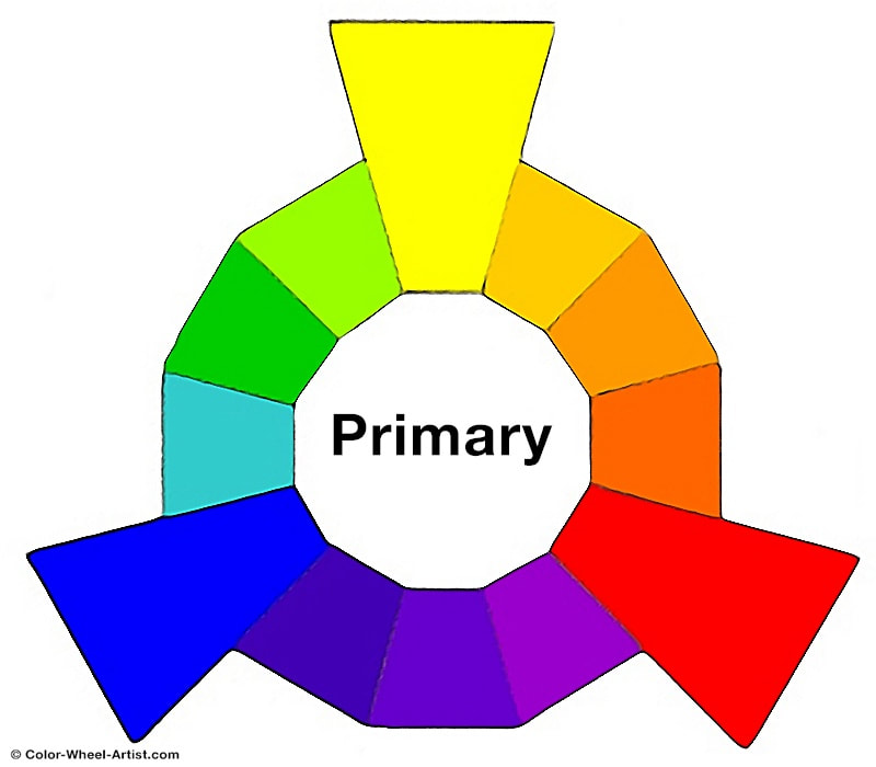 |
Divide your frosting into 3 separate bowls (one for each PRIMARY COLOR). Using your food coloring mix up a good RED, YELLOW, and BLUE frosting to use. Frost one cookie for each of these colors.
 |  |  |  |
| STEP 2: Mix Your SECONDARY COLORS SECONDARY COLORS are created when you mix any two primary colors together. GREEN, ORANGE and PURPLE. These are the colors formed by mixing the primary colors. Notice that each secondary colors is placed IN BETWEEN the two primary colors needed to mix it. YELLOW + BLUE = GREEN RED + YELLOW = ORANGE BLUE + RED = PURPLE | 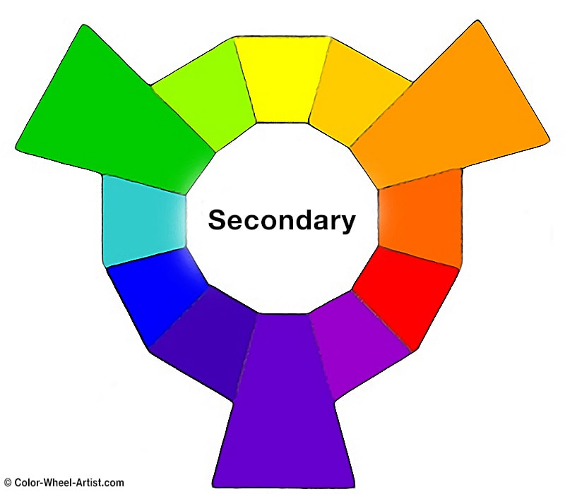 |
Using your PRIMARY COLORS frosting, try to mix each of the secondary colors and frost one cookie for each color (GREEN, ORANGE and PURPLE).
Mix your secondary colors in separate dishes so that you can use them later.
Mix your secondary colors in separate dishes so that you can use them later.
 |  |  |  |
| Arrange your cookies into a circular shape to create a BASIC COLOR WHEEL! Ready to move on to our second category in color theory... COLOR HARMONY? |  |
COLOR HARMONYIn art HARMONY means an arrangement of things in a work of art that is pleasing to look at. Specifically, in color theory, COLOR HARMONY means an artist uses a set or group of colors that FEELS good to look at or is pleasing to the eye. This means the colors work together well. Throughout our online lessons we have learned about some specific color schemes, pairs, and families that artists often use because they "HARMONIZE" with each other. This means they look really good together. |  |
We are now going to use RELATED COLOR FAMILIES or ANALOGOUS COLOR FAMILIES and COMPLIMENTARY COLOR PAIRS to create some cookies that represent a few of these harmonies. First lets talk about...
ANALOGOUS COLORS or RELATED COLOR FAMILIESThese are colors that are like family, they are very close together and stand by each other's side. These FAMILIES consist of two of the three PRIMARY COLORS and the SECONDARY COLOR they mix to create. Needless to say, these colors mix very well and create beautiful colors when painting. Using the PRIMARY and SECONDARY Colors you have already mixed, decorate one cookie for each of the 3 ANALOGOUS Color Families listed here... | 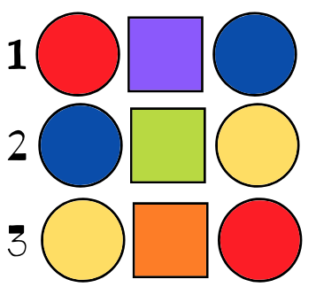 |
 |  |  |
COMPLIMENTARY COLOR PAIRSThese are colors that like a pair of good friends. Although they are beautiful, bold and bright on their own, when they are together they are truly outstanding! These colors love to make each other look good....they "compliment" each other. Like some pairs of friends, they are COMPLETE OPPOSITES. This makes it easy to find them on the color wheel. The pair consists of a PRIMARY COLOR and the SECONDARY COLOR that is OPPOSITE or across from it on the color wheel. | 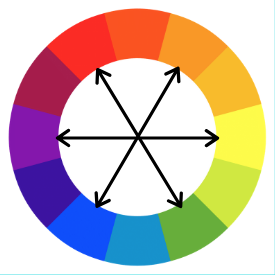 |
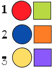 | Although, these colors make each other look really great, they DO NOT mix well together when painting. They each like to shine beautifully on their own...like all best friends should. Using the PRIMARY and SECONDARY Colors you have already mixed, decorate one cookie for each of the 3 ANALOGOUS Color Families listed here... |
 |  |  |

 RSS Feed